Wednesday, September 23, 2009
Tuesday, September 22, 2009
Horizontal Harmony
[Screenshots/Images top to bottom: Graphic Therapy ; Realities:United ; Bluesfear Worm; Soulwax/ 2 Many DJ's (2007! oops)]
The Horizontal Way is a website dedicated to horizontal web layout and navigation. It’s an original but surprisingly rare solution, and is most suited to image content, rather than text. Such as portfolios or design publications. The site describes its applications, using examples to illustrate the possibilities.
The soulwax/2 Many DJs site is also surprisingly fresh for a pair of overrated Belgian goons. Its ‘fairly unusable’, but it’s interesting, and in any case I’m not sure functionality was their primary objective. And its not the National Rail website, so don’t complain. Someone grey did that one, so your granny will still be able to book her train.
Geometry James
James Kirkup is responsible for some refreshing graphic design. At 21 years old, he has a calm aesthetic that belies his years, and is likewise modest about his portfolio. Often overlaying simple geometry over existential photography, his use of placelessness is reminiscent of avant-garde 70’s graphical dreamscapes, like those of Superstudio.
I am also a particluar fan of his laissez-faire attitude towards and crop marks and colour bars around the edges of his posters.
View more James’s portfolio and other enterprises on his site. He also contributes to the 'SluttyFringe' blog. And check out the rest of the creative web-community on Cargo Collective.
Thursday, September 17, 2009
Modular Mission


[Top to bottom: Zvi Hecker's Dubiner House, Ramat Gan 1960; Detail of a second housing complex in Ramat Gan, 1972; Moshe Safdie's Habitat 67 for the 1967 Montreal World Expo]
Zvi Hecker , born May 31, 1931 in Krakow, Poland is an Israeli architect currently working in Berlin. Enjoying success around the 70’s, a subsequent slowdown has seen him largely overlooked. He accumulated an eclectic portfolio of built and unbuilt work, using a formula of geometry and chaos.
His studies in crystallography in particular generated some interesting results, as manifested in the Ramat Gan residential complex in Jesusalem, 1979 – 1985. Using the crystalline analogy he was able to generate flexible and perpetual forms. Unfortunately this proved a constructional nightmare, and threw architectural values to the wind. Sharply sloping walls also somewhat affected the functionality of the internal spaces.
His creative use of modularity has been significant for modern architecture, and his 1960 Dubiner house was a precursor to Moshe Safdie ’s Ubiquitous Habitat 67, at the Montreal World Expo in 1967. Moreover his intricacy is a pleasure to behold at an architectural scale. His website is impressively bad on all fronts, but if you brave it you will find more of his work.
Refs:
Architecture,
Expo,
Habitat 67,
Modular,
Montreal,
Moshe Safdie,
Zvi Hecker
Wednesday, September 16, 2009
Fresh Beats
I will briefly excuse myself for the puerility of this post, and I'll agree its old - nearly 250,000 people have seen it. But people are still commenting on it, and ignorance craves provision. Its MSTRKFT's Oh snap!! bootleg, and it deserves a special mention for being an excellent example of VJing, using extremely limited material. And it has kept me both visually and aurally amused. Big Willie and Jazzy smash it. One distraught viewer remarked:
'Try doing this for 4 minutes...I dare you'. I think everyone should.
'Try doing this for 4 minutes...I dare you'. I think everyone should.
Refs:
Bounce,
Fresh Prince,
Jazzy Jeff,
MSTRKRFT,
music,
Video,
VJ,
Will Smith
Tuesday, September 15, 2009
Flourescent Fandango


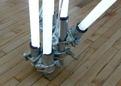
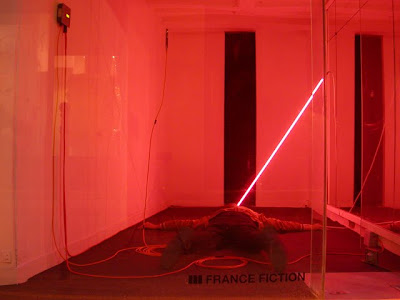
Born in Mexico City in 1977 and currently working from NYC, Alejandro Almanza Pereda says that his work creates tension, ”Related to how we see risk and how we see danger, and the respect that we have for these.” [Interview]
Pereda creates precarious compositions using everyday objects and materials to create a sense of tension and impending danger, using our familiarity with them to heighten our measure of improbability. One critic even came up with the profound conclusion that it:
“Highlights human frailty…like the soft wind from an oscillating fan”
Wow. Really? Intellectual over-indulgence is an artistic prerogative. Probably heightened by the Mexican’s national shame [hilarious?]. But Alejandro needn’t worry so. While some of the more inert structures might ‘create tension’, others suggest freedom. And these interest me the most.
Assembled with fluorescent light tubes and clamps, the sculptures imitate the modular makeup of scaffolding (as above). His structural use of lighting components is poetic, and replacing the dull metal with glowing tubes is not only mesmerizing, but it seems so logical (although no one else saw it coming) as they share similar dimensions. And the compositions maintain the same material familiarity that we can identify with, flaunting any 'nu'-age media.
I’m very jealous, and intend to make my own scaffold lamp.
Refs:
Alejandro Almanza Pereda,
Art,
Flourescent,
Installation,
Light,
Sculpture
Thursday, September 10, 2009
'Fucking Summer'
In May Platoon launched the 'Fucking summer' / 'scheiss sommer' promotional campaign for the Arena summer season 2009. The operation included a holistic campaign of posters, online, social networks, adds and more. Arena is a post-industrial complex on Berlin's river Spree, hosting creative businesses, bars, concerts, cultural events [recently international design festival DMY] and river-bound pool the 'Badeschiff' / 'Pool-Ship'.
For a while the area was battered with the thematic posters, which used an eye-catching blend of straws, piss, ketchup, condensation and cigerettes to put their point across. It's exemplary of the continental branch of rational photography and is preferable to silly indie shots of some gymnastic goth contorting 'to the beat'. And likewise preferable to the predictable graphical melodrama that promotions usually employ. They have a natural, dreamy depth and satirical 'truth' that lends depth to the environment they're pasted to. But they suffered for their art, as their collectibility became a problem for the campaign.
For a while the area was battered with the thematic posters, which used an eye-catching blend of straws, piss, ketchup, condensation and cigerettes to put their point across. It's exemplary of the continental branch of rational photography and is preferable to silly indie shots of some gymnastic goth contorting 'to the beat'. And likewise preferable to the predictable graphical melodrama that promotions usually employ. They have a natural, dreamy depth and satirical 'truth' that lends depth to the environment they're pasted to. But they suffered for their art, as their collectibility became a problem for the campaign.
Refs:
Arena,
Badeschiff,
Berlin,
Campaign,
Platoon,
Poster,
Summer,
Visual Communication,
Visual Identity
Tuesday, September 8, 2009
Friday, September 4, 2009
Fanimatronic
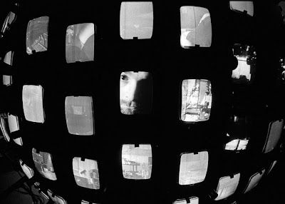
[Jonathan Schipper's installation "215 Points of View" on display at Pierogi's Boiler space during art fair week 2009]
I came across this chap, Jonathan Schipper, on his quest to uncover our humanity, with his project ‘Invisible Sphere’ (above). A 5.5 foot diameter sphere covered with video monitors & surveillance cameras, each monitor displays a live video feed from a camera placed on the opposite side of the sphere. The sphere can be rolled around in its environment and is a surveillance device that reveals what is just beyond it. Its scale & mobility defy secrecy. It’s an example of his narrative ability, which could be put to good cinematic effect. And in fact reminds me a bit ofthe film 12 Monkeys.
The Brooklyn-based artist's favored mediums are mechanics, video and sculpture, and some of his animatronic creations are as acute as they are disturbing. Check out the project videos on his site , they clarify a lot. Also, a visit to the artists' studio, on the 'Cool Hunting' Youtube channel.
Overall he seems like the kind of man whose drinks invitation you should decline, as his Victorian-theme party in the woods would turn out to be an elaborate bluff, and he would probably just cast you into his next sculpture or shank you with a pneumatic axe.
Refs:
Art,
CRT,
Gallery,
Jonathan Schipper,
Light,
Media,
Monitors,
New York,
Pierogi Boiler,
Televisions
Layout Lexicon
Refs:
DeviantArt,
Guide,
Layout,
Newspaper,
Th Guardian,
Visual Communication
Subscribe to:
Posts (Atom)


